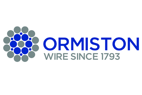
New identity for historic wire manufacturer

The identity is inspired by the cross-sectional view across a wire cable. Wires of differing diameters are braided together in a set pattern to form stronger wire cables. As a company with a substantial environmental policy, including a Queen’s Award for Sustainable Development, the logo also referencing the shape of a flower seems apt.
Below is the old identity used for many decades before the new branding programme was implemented.
Posted:
February 15th, 2012
Category:
Branding.