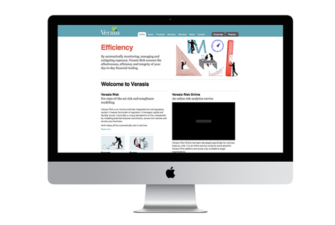
New website design and build for Verasis
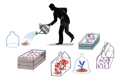
The website style was based on a series images by illustrator Aude Van Ryn. Her work can be viewed here Aude Van Ryn Key words, such as Clarity, Consistency, Simplicity, and Efficacy were illustrated, putting the benefits of the software to the fore in an easily understood manner. This allows the site to speak equally to both directors and technical staff of clients.
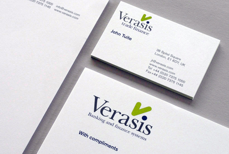 This is the second site we have developed for Verasis over a ten year period. Above is the initial identity created that involved a naming programme for both the company name and products.
Applications of the branding programme included: Brand strategy, Website, Brand architecture, Naming, Identity, Visual identity, Stationery.
To see examples of the work carried out view the case study Verasis case study
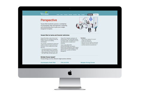
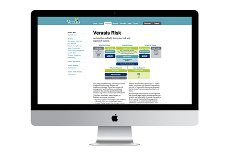 Click here to view the Verasis site Verasis website
Posted:
October 19th, 2012
Category:
Branding.